
Module 3 — Explainable AI#
DesignSafe AI Training


An MLP trades three readable exponents for thousands of weights#
Module 2 ended on an uncomfortable trade. The linear model in log space gave us
three numbers — 0.5, 1.5, -0.5 — that were the physics. The MLP matched
it without being told anything, and handed back a few thousand weights that mean
nothing to anyone.
For a cantilever we could check the answer against a closed form. On a real dataset there is no closed form to check against, and “the network said so” is not an answer you can put in a report or defend to a reviewer.
This module is about getting the interpretation back.
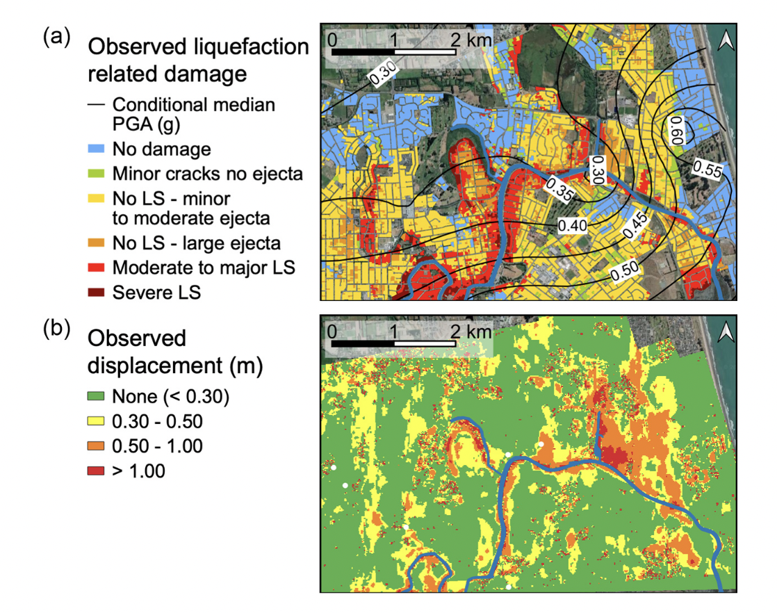
Lateral spreading, from 7,291 field observations#
Lateral spreading — the down-slope movement of liquefied ground during an earthquake. It wrecks pipelines, bridge abutments, and quay walls. We have 7,291 field observations, each labelled did or did not spread, with four predictors.
| 5 | From local attributions to global structure |
Setup#
%pip install scikit-learn pandas xgboost shap matplotlib --quiet
/private/tmp/claude-501/-Users-krishna-dev-DesignSafe-Training/a3c591bf-7af0-4642-a72e-3ed72e972147/scratchpad/venv/bin/python: No module named pip
Note: you may need to restart the kernel to use updated packages.
%matplotlib inline

from pathlib import Path

import numpy as np
import pandas as pd
import matplotlib.pyplot as plt

RNG = 42
np.random.seed(RNG)
plt.rcParams.update({"figure.figsize": (10, 4.5), "font.size": 11})


def find_data(name):
    """Locate a data file whether we are on DesignSafe, Colab, or a laptop."""
    here = Path.cwd()
    for c in [Path("/home/jupyter/CommunityData/Training/2026-SPARC/Day3/3b-SciML") / name, here / name,
              here / "03-xai" / name, here.parent / name]:
        if c.exists():
            return c
    url = ("https://raw.githubusercontent.com/DesignSafe-CI/training-ai"
           f"/main/03-xai/{name}")
    print(f"Not found locally, downloading from {url}")
    return url
Four predictors survive; two are dropped#
The raw file has six columns plus the label. We keep four as predictors.
Column |
Meaning |
Why it might matter |
|---|---|---|
|
Groundwater depth |
Liquefaction needs saturated soil; a deeper water table means less susceptible material |
|
Distance to the free face |
Spreading needs somewhere to go — a channel, a shoreline |
|
Ground slope |
The driving force for down-slope movement |
|
Peak ground acceleration |
The demand: how hard the ground shook |
~~ |
Elevation |
Dropped — largely redundant with the slope and free-face geometry |
~~ |
Record identifier |
Dropped — an index, not a predictor. Leaving an ID in is a classic leakage bug |
|
1 = spreading observed, 0 = not |
The label |
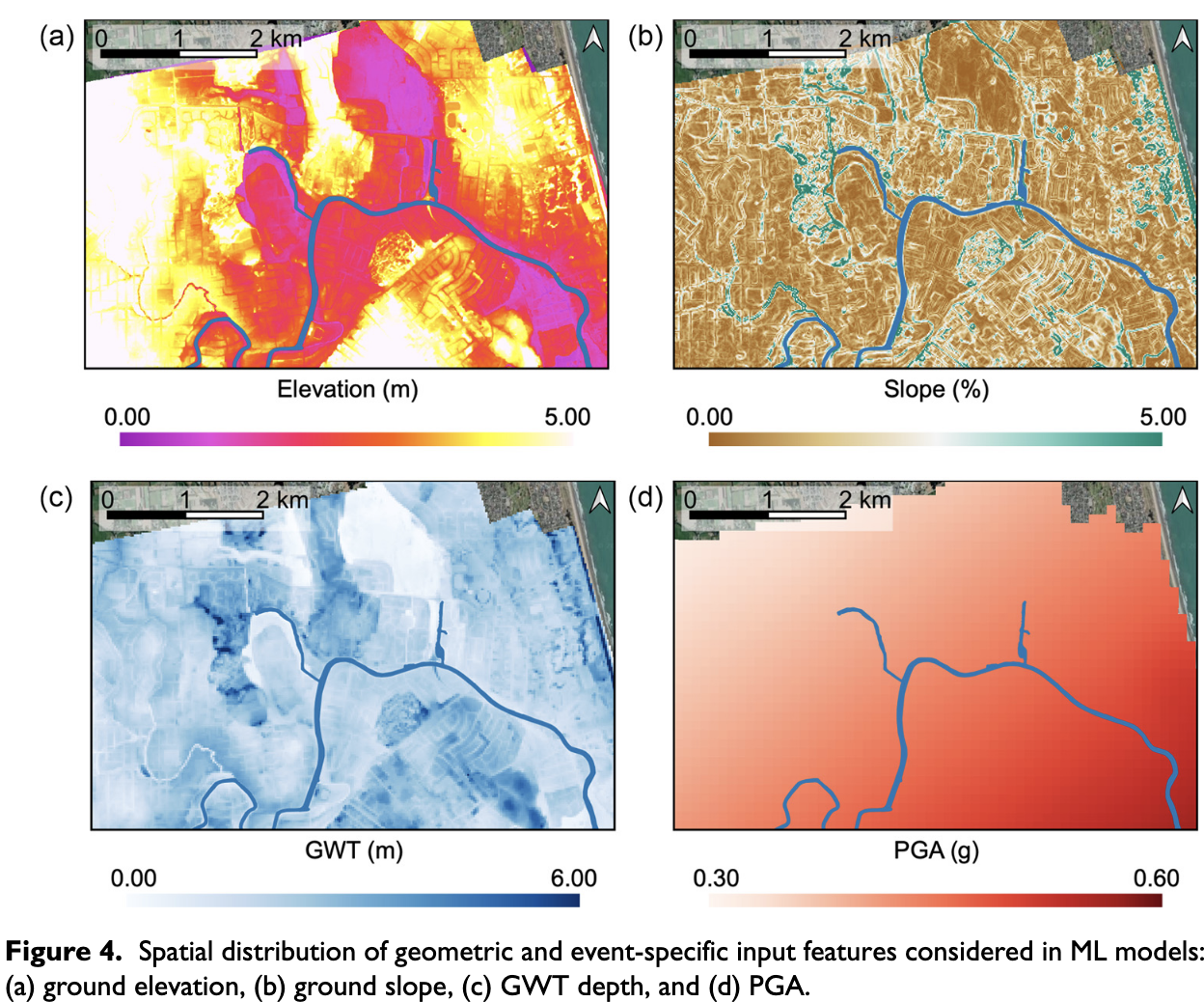
df = pd.read_csv(find_data("RF_YN_Model3.csv"))
print(f"{len(df)} observations")
df.head()
7291 observations
| Test ID | GWD (m) | Elevation | L (km) | Slope (%) | PGA (g) | Target | |
|---|---|---|---|---|---|---|---|
| 0 | 182 | 0.370809 | 0.909116 | 0.319117 | 5.465739 | 0.546270 | 0 |
| 1 | 15635 | 1.300896 | 1.123009 | 0.211770 | 0.905948 | 0.532398 | 0 |
| 2 | 8292 | 1.300896 | 0.847858 | 0.195947 | 0.849104 | 0.532398 | 0 |
| 3 | 15629 | 1.788212 | 2.044325 | 0.115795 | 0.451034 | 0.542307 | 0 |
| 4 | 183 | 1.637517 | 2.003797 | 0.137265 | 0.941866 | 0.545784 | 1 |
df = df.drop(["Test ID", "Elevation"], axis=1)

features = [c for c in df.columns if c != "Target"]
X = df[features]
y = df["Target"]

print(f"{len(features)} predictors: {features}")

print("class balance:")
print(f"  no spreading (0):  {(y == 0).sum():>5d}   ({(y == 0).mean():.1%})")
print(f"  spreading    (1):  {(y == 1).sum():>5d}   ({(y == 1).mean():.1%})")
print("\nReasonably balanced, so plain accuracy is a fair headline metric.")
df.describe().T[["mean", "std", "min", "max"]]
4 predictors: ['GWD (m)', 'L (km)', 'Slope (%)', 'PGA (g)']
class balance:
  no spreading (0):   4236   (58.1%)
  spreading    (1):   3055   (41.9%)

Reasonably balanced, so plain accuracy is a fair headline metric.
| mean | std | min | max | |
|---|---|---|---|---|
| GWD (m) | 2.075960 | 0.641597 | 0.370809 | 6.047182 |
| L (km) | 1.018893 | 0.646159 | 0.000000 | 3.289537 |
| Slope (%) | 1.139434 | 1.133215 | 0.000000 | 10.922902 |
| PGA (g) | 0.439751 | 0.042140 | 0.328797 | 0.567631 |
| Target | 0.419010 | 0.493431 | 0.000000 | 1.000000 |
Tune on validation; touch the test set once#
Train / validation / test. The validation set is what you tune against; the test
set you touch once, at the end. Two calls to train_test_split give us the
three-way split.
from sklearn.model_selection import train_test_split

X_train, X_hold, y_train, y_hold = train_test_split(
    X, y, test_size=0.3, random_state=RNG, stratify=y)
X_val, X_test, y_val, y_test = train_test_split(
    X_hold, y_hold, test_size=0.5, random_state=RNG, stratify=y_hold)

for name, part in (("train", y_train), ("val", y_val), ("test", y_test)):
    print(f"  {name:>5s}  {len(part):>5d} rows   {part.mean():.1%} positive")
  train   5103 rows   41.9% positive
    val   1094 rows   42.0% positive
   test   1094 rows   41.9% positive
Part 1 — The decision tree: a model you can read#
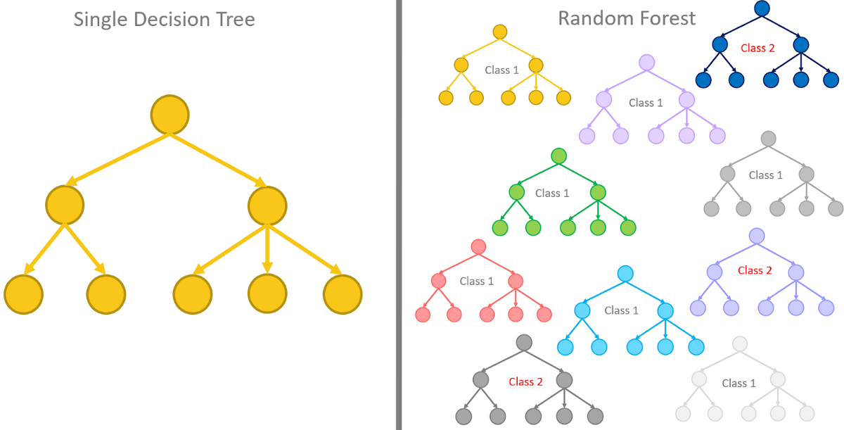
A decision tree asks a sequence of threshold questions. At each node it picks the split that most reduces Gini impurity,
which is 0 for a pure node (all one class) and 0.5 for a 50/50 mix in a binary problem. The tree greedily searches every feature and every threshold for the split with the largest weighted drop in \(G\).
Start shallow, so we can print the whole thing.
from sklearn import tree
from sklearn.metrics import accuracy_score

dt = tree.DecisionTreeClassifier(max_depth=3, random_state=RNG).fit(X_train, y_train)

print(f"  train {dt.score(X_train, y_train):.1%}")
print(f"  val   {dt.score(X_val, y_val):.1%}")
  train 68.2%
  val   68.9%
fig, ax = plt.subplots(figsize=(15, 7))
tree.plot_tree(dt, feature_names=features, class_names=["no", "spread"],
               filled=True, rounded=True, fontsize=9, impurity=True, ax=ax)
plt.title("Depth-3 decision tree — the entire model, on one page")
plt.tight_layout()
plt.show()
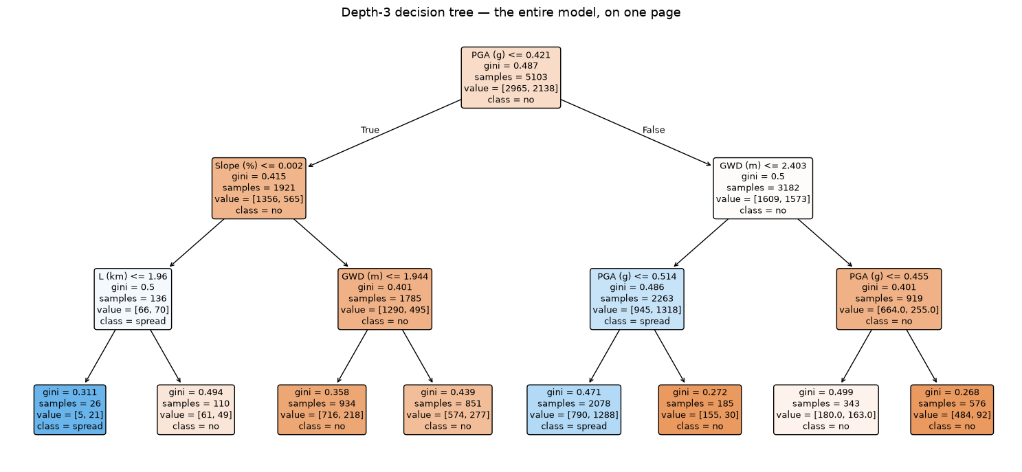
This is the baseline that XAI is trying to get back to. You can read the root split straight off the figure, hand the diagram to a geotechnical engineer, and have an argument about whether the thresholds are sensible. No attribution method needed — the model is its own explanation.
Now watch what we give up to gain accuracy.
depths = [1, 2, 3, 5, 7, 9, 12, 15, None]
rows = []
for d in depths:
    m = tree.DecisionTreeClassifier(max_depth=d, random_state=RNG).fit(X_train, y_train)
    rows.append({"max_depth": str(d), "leaves": m.get_n_leaves(),
                 "train": m.score(X_train, y_train), "val": m.score(X_val, y_val)})

depth_df = pd.DataFrame(rows)
print(depth_df.to_string(index=False,
      formatters={"train": "{:.1%}".format, "val": "{:.1%}".format}))

plt.figure(figsize=(6.5, 4))
plt.plot(range(len(depths)), depth_df["train"], "o-", label="train")
plt.plot(range(len(depths)), depth_df["val"], "s-", label="validation")
plt.xticks(range(len(depths)), depth_df["max_depth"])
plt.xlabel("max_depth"); plt.ylabel("accuracy")
plt.title("The same overfitting curve as Module 2, different model class")
plt.legend(); plt.grid(alpha=.3); plt.show()
max_depth  leaves  train   val
        1       2  58.1% 58.0%
        2       4  65.5% 65.8%
        3       8  68.2% 68.9%
        5      30  70.8% 71.0%
        7      93  78.2% 73.5%
        9     211  83.0% 74.9%
       12     422  90.9% 77.7%
       15     645  96.8% 79.4%
     None     808 100.0% 79.7%
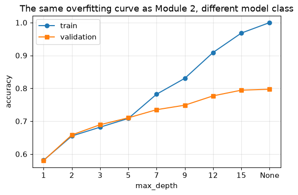
Deeper trees memorise: training accuracy runs to 100% while validation accuracy peaks and then decays. Exactly the gap we opened with the width-256 MLP in Module 2 — overfitting is a property of capacity versus data, not of neural networks specifically.
By max_depth=15 the tree has hundreds of leaves. It is still technically
“readable”, in the sense that a phone book is readable.
Part 2 — Gradient boosting: accuracy at the cost of legibility#
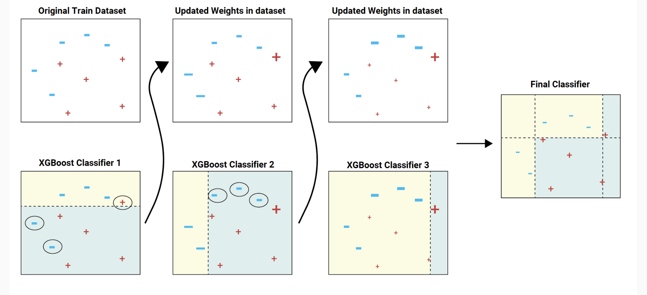
One tree is a weak learner. Boosting fits a sequence of trees where each new tree is trained on the residual errors of the ensemble so far:
That is gradient descent, but in function space — each tree is a step along the negative gradient of the loss. XGBoost adds second-order (Newton) information, an \(L^2\) penalty on leaf weights, shrinkage, and column subsampling.
import xgboost

xgb = xgboost.XGBClassifier(
    n_estimators=400, max_depth=4, learning_rate=0.05,
    subsample=0.9, colsample_bytree=0.9,
    eval_metric="logloss", random_state=RNG,
).fit(X_train, y_train)

best_dt = tree.DecisionTreeClassifier(max_depth=7, random_state=RNG).fit(X_train, y_train)

print(f"{'model':<28s} {'train':>8s} {'val':>8s}")
print(f"{'decision tree (depth 3)':<28s} {dt.score(X_train,y_train):>7.1%} {dt.score(X_val,y_val):>8.1%}")
print(f"{'decision tree (depth 7)':<28s} {best_dt.score(X_train,y_train):>7.1%} {best_dt.score(X_val,y_val):>8.1%}")
print(f"{'XGBoost (400 trees)':<28s} {xgb.score(X_train,y_train):>7.1%} {xgb.score(X_val,y_val):>8.1%}")
print(f"\nThe ensemble contains {400 * 1} trees. Good luck reading it.")
model                           train      val
decision tree (depth 3)        68.2%    68.9%
decision tree (depth 7)        78.2%    73.5%
XGBoost (400 trees)            86.0%    78.3%

The ensemble contains 400 trees. Good luck reading it.
A few points of accuracy, bought with 400 trees. The model is now a black box in exactly the way the Module 2 MLP was: it works, and it cannot tell you why.
That is the setup for the rest of the module.
Part 3 — Feature importance, and why the number depends on who you ask#
“Which features matter?” sounds like one question. It is at least three, and they do not have to agree.
Definition |
What it counts |
Failure mode |
|---|---|---|
Weight / frequency |
How many times a feature is split on |
Favours high-cardinality continuous features — they offer more thresholds to try |
Gain |
Total impurity reduction credited to the feature |
Biased toward features used near the root |
Permutation |
Accuracy lost when you shuffle that column |
Model-agnostic and honest, but misleading under correlated features |
The first two are free (they fall out of the fitted trees). The third costs a re-evaluation per feature but measures something you actually care about: predictive contribution.
from sklearn.inspection import permutation_importance

gain = xgb.get_booster().get_score(importance_type="gain")
weight = xgb.get_booster().get_score(importance_type="weight")

perm = permutation_importance(xgb, X_val, y_val, n_repeats=10,
                             random_state=RNG, scoring="accuracy")

imp = pd.DataFrame({
    "weight": [weight.get(f, 0) for f in features],
    "gain": [gain.get(f, 0) for f in features],
    "permutation": perm.importances_mean,
}, index=features)

# Normalise each column to fractions so the three are comparable.
imp_n = imp / imp.sum()
print("Feature importance, each column normalised to sum to 1:\n")
print(imp_n.to_string(float_format="{:.3f}".format))

print("\nRanking by each definition:")
for col in imp_n.columns:
    order = " > ".join(imp_n[col].sort_values(ascending=False).index)
    print(f"  {col:>12s}:  {order}")
Feature importance, each column normalised to sum to 1:

           weight  gain  permutation
GWD (m)     0.229 0.255        0.231
L (km)      0.278 0.274        0.335
Slope (%)   0.167 0.143        0.026
PGA (g)     0.326 0.328        0.408

Ranking by each definition:
        weight:  PGA (g) > L (km) > GWD (m) > Slope (%)
          gain:  PGA (g) > L (km) > GWD (m) > Slope (%)
   permutation:  PGA (g) > L (km) > GWD (m) > Slope (%)
ax = imp_n.plot.bar(figsize=(9, 4.2), rot=20, width=.78)
ax.set_ylabel("normalised importance")
ax.set_title("Three definitions of 'importance', one model")
ax.legend(title=None)
plt.tight_layout(); plt.show()
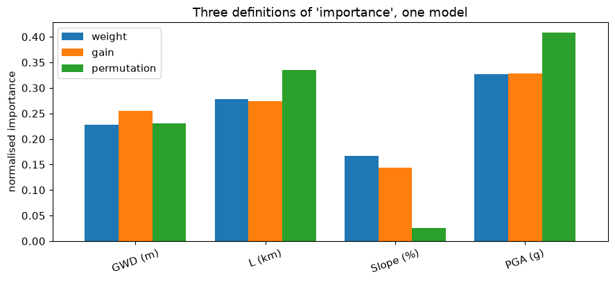
The three definitions agree on rank and differ 5x on slope#
Good news first: all three definitions produce the same ranking here — PGA, then distance to the free face, then groundwater depth, then slope. When that happens it is genuine reassurance, and worth reporting.
Now look at the magnitudes, where they part company badly.
Slope is worth about 14-17% by gain and weight, and about 2-3% by permutation — a factor of five or six. The tree splits on slope frequently and collects impurity reduction when it does, yet shuffling the slope column barely dents accuracy.
That combination is not a contradiction; it is a diagnosis. It is the signature of a feature whose information is already available elsewhere. Gain answers “does the model use this?” — yes. Permutation answers “does the model need this?” — apparently not, because when slope is destroyed the other features cover for it.
Which is exactly what you would expect physically: slope, elevation, and distance
to a free face all describe the same site geometry. We dropped Elevation at the
start for that reason; the residual redundancy between slope and free-face
distance is still in there.
So the practical rules are:
Say which definition you used. “Feature importance” alone is not a number.
A gain/permutation mismatch means redundancy, not noise. Do not conclude “slope does not matter for lateral spreading” — it matters physically, and the model has simply found other routes to the same information.
Permutation importance is unreliable under correlated features for precisely this reason: it asks what happens when one feature is destroyed while its correlates stay intact.
There is a further limitation that no column here escapes: all three are global statements about the model averaged over 7,291 sites. None can tell you why this site, with these four values, was flagged — which is the question an engineer assessing a specific site actually has.
Part 4 — SHAP: attributing one prediction#
SHAP borrows the Shapley value from cooperative game theory (Shapley, 1953).
Shapley values split credit over every joining order#
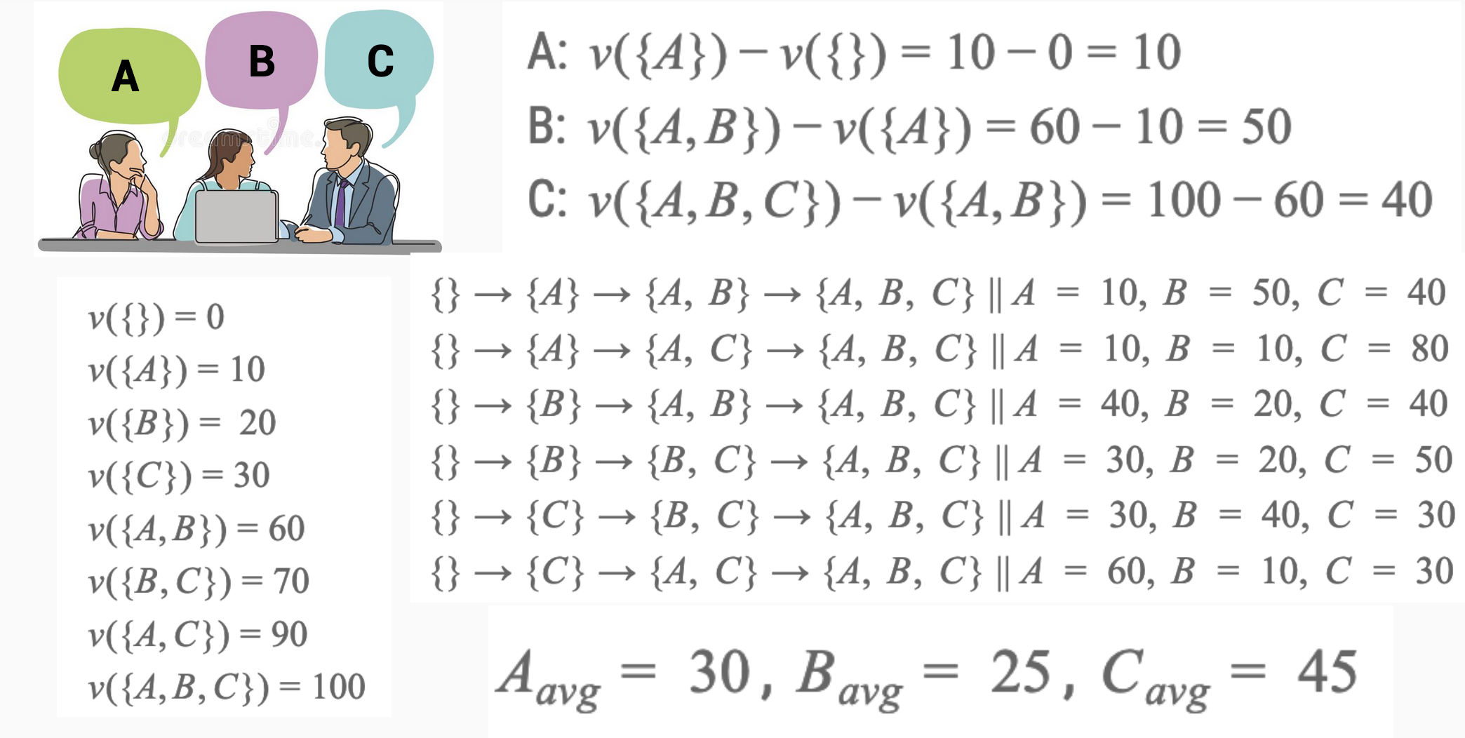
Three engineers finish a project worth $100k. How much of the credit belongs to each? Shapley’s answer: consider every possible order in which they could have joined the project. For each ordering, record how much the value went up when a given person joined. Average that marginal contribution over all orderings.
Swap “engineer” for “feature” and “project value” for “model output”:
\(\phi_i\) is the contribution of feature \(i\) to this one prediction, averaged over every subset \(S\) of the other features.
Efficiency, symmetry and dummy pin down one answer#
Shapley values are the unique attribution satisfying three axioms:
Efficiency — the attributions sum exactly to the prediction minus the baseline: \(\sum_i \phi_i = f(x) - \mathbb{E}[f]\). Nothing is lost or invented.
Symmetry — two features that always contribute identically get equal credit.
Dummy — a feature that never changes the output gets exactly zero.
No other attribution method has all three. The catch is cost: the sum runs over
\(2^{|F|}\) subsets. TreeSHAP exploits tree structure to compute it exactly in
polynomial time, which is why SHAP and gradient boosting are so often paired.
import shap

explainer = shap.TreeExplainer(xgb)
shap_values = explainer(X_test)

print(f"shap_values.values shape: {shap_values.values.shape}   (rows x features)")
print(f"baseline E[f(x)]        : {shap_values.base_values[0]:+.4f}  (log-odds)")
print("\nEfficiency check on the first 5 rows — attributions must sum to f(x) - E[f]:")
margin = xgb.predict(X_test, output_margin=True)
for i in range(5):
    lhs = shap_values.values[i].sum()
    rhs = margin[i] - shap_values.base_values[i]
    print(f"  row {i}:  sum(phi) = {lhs:+.5f}   f(x)-E[f] = {rhs:+.5f}   "
          f"diff {abs(lhs - rhs):.2e}")
shap_values.values shape: (1094, 4)   (rows x features)
baseline E[f(x)]        : -0.3301  (log-odds)

Efficiency check on the first 5 rows — attributions must sum to f(x) - E[f]:
  row 0:  sum(phi) = +0.87078   f(x)-E[f] = +0.87078   diff 5.96e-08
  row 1:  sum(phi) = +0.95742   f(x)-E[f] = +0.95742   diff 1.19e-07
  row 2:  sum(phi) = +0.47126   f(x)-E[f] = +0.47126   diff 2.98e-08
  row 3:  sum(phi) = -1.44210   f(x)-E[f] = -1.44210   diff 7.15e-07
  row 4:  sum(phi) = -0.83632   f(x)-E[f] = -0.83632   diff 5.96e-07
/private/tmp/claude-501/-Users-krishna-dev-DesignSafe-Training/a3c591bf-7af0-4642-a72e-3ed72e972147/scratchpad/venv/lib/python3.12/site-packages/tqdm/auto.py:21: TqdmWarning: IProgress not found. Please update jupyter and ipywidgets. See https://ipywidgets.readthedocs.io/en/stable/user_install.html
  from .autonotebook import tqdm as notebook_tqdm
The attributions sum to the prediction, to machine precision. That is the efficiency axiom, verified — and the reason SHAP can be defended in a way that “gain” cannot.
One site, decomposed: why this one spreads#
The waterfall plot starts at the baseline \(\mathbb{E}[f]\) and adds one feature at a time until it reaches this site’s prediction.
proba = xgb.predict_proba(X_test)[:, 1]
i_pos = int(np.argmax(proba))
i_neg = int(np.argmin(proba))

print(f"Most confident SPREAD  : row {i_pos}, p = {proba[i_pos]:.3f}")
print(X_test.iloc[i_pos].to_string())

shap.plots.waterfall(shap_values[i_pos], max_display=len(features) + 1, show=False)
plt.title(f"Predicted spreading, p = {proba[i_pos]:.3f}", pad=18)
plt.tight_layout(); plt.show()
Most confident SPREAD  : row 102, p = 0.987
GWD (m)      1.027148
L (km)       0.019104
Slope (%)    1.618521
PGA (g)      0.436892
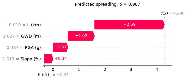
Red bars push toward spreading, blue bars push away. The bar lengths are in log-odds and they add up to the gap between the baseline and this prediction.
The same machinery, opposite conclusion#
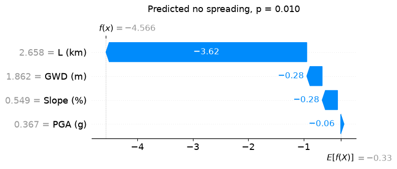
Same model, same machinery, opposite conclusion — and you can see which features did the work.
print(f"Most confident NO SPREAD: row {i_neg}, p = {proba[i_neg]:.3f}")
print(X_test.iloc[i_neg].to_string())

shap.plots.waterfall(shap_values[i_neg], max_display=len(features) + 1, show=False)
plt.title(f"Predicted no spreading, p = {proba[i_neg]:.3f}", pad=18)
plt.tight_layout(); plt.show()
Most confident NO SPREAD: row 357, p = 0.010
GWD (m)      1.862229
L (km)       2.658382
Slope (%)    0.549205
PGA (g)      0.367333
Part 5 — From local attributions to global structure#
Compute SHAP values for every row and you can rebuild a global picture — but one that keeps the per-site detail instead of averaging it away.
The beeswarm plot puts one dot per site per feature. Horizontal position is that site’s SHAP value; colour is the feature’s value.
shap.plots.beeswarm(shap_values, max_display=len(features), show=False)
plt.title("Every site, every feature", pad=18)
plt.tight_layout(); plt.show()
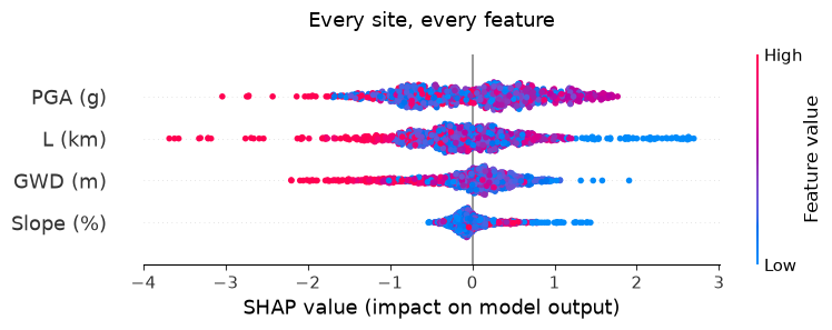
Read it as: does high (red) push right or left? A clean red-right / blue-left separation means a monotone effect and the colour tells you the sign.
This is where the physics check happens. Confirm each direction against what you know:
Slope — steeper ground should spread more readily. Higher slope pushing right is physically correct.
PGA — stronger shaking, more liquefaction. Higher PGA pushing right is correct.
GWD — a deeper water table means less saturated material in the critical zone, so higher GWD should push left.
L — further from a free face means less room to move, so higher L should push left.
If a direction comes out backwards, you have found something. Either a data problem (sign convention, units, a leaking column) or a genuine interaction the model is capturing through a proxy. Either way it is worth chasing before the model goes anywhere near a decision. This is the single most valuable thing XAI does — not “explaining” a model that is right, but catching one that is wrong for the right-looking reasons.
Dependence plots locate the triggering threshold#
A dependence plot shows SHAP value against feature value for one feature — the shape of the learned response, including any threshold.
fig, axes = plt.subplots(1, 2, figsize=(12, 4.2))
for ax, feat in zip(axes, ["PGA (g)", "GWD (m)"]):
    ax.scatter(X_test[feat], shap_values.values[:, features.index(feat)],
               s=9, alpha=.35, c=X_test["Slope (%)"], cmap="viridis")
    ax.axhline(0, color="k", lw=.8, ls="--")
    ax.set(xlabel=feat, ylabel=f"SHAP value for {feat}")
    ax.grid(alpha=.3)
axes[0].set_title("Where does shaking start to matter?")
axes[1].set_title("Where does the water table stop mattering?")
plt.tight_layout(); plt.show()

The crossing point — where the SHAP value passes through zero — is the value at which this feature flips from suppressing to promoting spreading. That is a threshold learned from data, directly comparable to the triggering curves in the literature. The vertical spread at fixed \(x\) is interaction with the other features (coloured here by slope).
optional — comparing the two models’ explanations#
The depth-3 tree and the 400-tree ensemble reach similar conclusions by different routes. Comparing their global SHAP magnitudes is a useful sanity check: large disagreement means the extra accuracy came from somewhere you should understand before trusting it.
dt_expl = shap.TreeExplainer(dt)
dt_sv = dt_expl(X_test)


def mean_abs_shap(sv):
    """Mean |SHAP| per feature, tolerating the per-class axis.

    A binary sklearn classifier returns values of shape
    (n_rows, n_features, n_classes) -- one attribution per class. Binary
    XGBoost returns (n_rows, n_features), because it models a single
    log-odds output. Take the positive class when the axis is present so
    the two models are compared on the same quantity.
    """
    v = sv.values
    if v.ndim == 3:
        v = v[:, :, 1]
    return np.abs(v).mean(0)


print(f"decision tree SHAP shape : {dt_sv.values.shape}")
print(f"XGBoost SHAP shape       : {shap_values.values.shape}")

cmp = pd.DataFrame({
    "tree (depth 3)": mean_abs_shap(dt_sv),
    "XGBoost (400)": mean_abs_shap(shap_values),
}, index=features)
cmp = cmp / cmp.sum()

ax = cmp.plot.bar(figsize=(8.5, 4), rot=20, width=.75)
ax.set_ylabel("mean |SHAP|, normalised")
ax.set_title("Do the readable model and the accurate model agree?")
plt.tight_layout(); plt.show()
print(cmp.to_string(float_format="{:.3f}".format))
decision tree SHAP shape : (1094, 4, 2)
XGBoost SHAP shape       : (1094, 4)
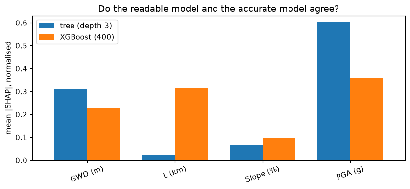
           tree (depth 3)  XGBoost (400)
GWD (m)             0.309          0.225
L (km)              0.024          0.316
Slope (%)           0.067          0.098
PGA (g)             0.600          0.361
The test set, touched once, gives the honest score#
We have touched the test set exactly once so far. Here is the honest final score.
from sklearn.metrics import classification_report, confusion_matrix

print(classification_report(y_test, xgb.predict(X_test),
                            target_names=["no spreading", "spreading"], digits=3))

cm = confusion_matrix(y_test, xgb.predict(X_test))
fig, ax = plt.subplots(figsize=(4.6, 4))
ax.imshow(cm, cmap="Blues")
for (r, c), v in np.ndenumerate(cm):
    ax.text(c, r, str(v), ha="center", va="center",
            color="white" if v > cm.max() / 2 else "black", fontsize=13)
ax.set(xticks=[0, 1], yticks=[0, 1],
       xticklabels=["pred no", "pred spread"],
       yticklabels=["true no", "true spread"], title="Test-set confusion matrix")
plt.tight_layout(); plt.show()
              precision    recall  f1-score   support

no spreading      0.792     0.874     0.831       636
   spreading      0.796     0.681     0.734       458

    accuracy                          0.793      1094
   macro avg      0.794     0.778     0.783      1094
weighted avg      0.794     0.793     0.790      1094
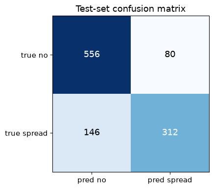
In a hazard setting the two off-diagonal cells are not equally bad. A false negative is a site you declared safe that spreads; a false positive is money spent on ground improvement you did not need. Which error you tolerate is an engineering decision, not a modelling one — you tune it by moving the probability threshold away from 0.5, not by changing the model.
Summary#
Interpretability is a spectrum |
A depth-3 tree explains itself. A 400-tree ensemble does not. You choose where to sit. |
“Feature importance” is not one number |
Weight, gain, and permutation agreed on the ranking here but differed 5-6x on slope’s magnitude. Say which one you used. |
A gain/permutation gap means redundancy |
The model used slope but did not need it. That is a fact about the feature set, not about the physics. |
Global importance answers the wrong question |
Engineers assess sites, not datasets. SHAP attributes individual predictions. |
SHAP is uniquely principled |
Efficiency, symmetry, and dummy pin it down to one answer, and we verified efficiency numerically. |
The real payoff is catching bad models |
A physically backwards SHAP direction is a bug you would otherwise have shipped. |
Physics in the model beats interrogating it afterwards#
Module 2 traded three interpretable exponents for a few thousand opaque weights. SHAP is how you buy the interpretation back after the fact.
Note what it is not: SHAP tells you what the model did, not what the ground does. It is a statement about a function fitted to 7,291 observations. Correlation in the training data becomes attribution in the explanation.
Which is why the next two modules take the opposite route. Instead of fitting a flexible model and interrogating it afterwards, we build the physics into the model itself — so that it cannot learn a relationship that violates the governing equations in the first place.
Go deeper#
Full XAI training notebook — the longer version of this module, with the Gini derivations worked out
Lundberg & Lee (2017), A Unified Approach to Interpreting Model Predictions — the SHAP paper
Molnar, Interpretable Machine Learning — the standard free reference